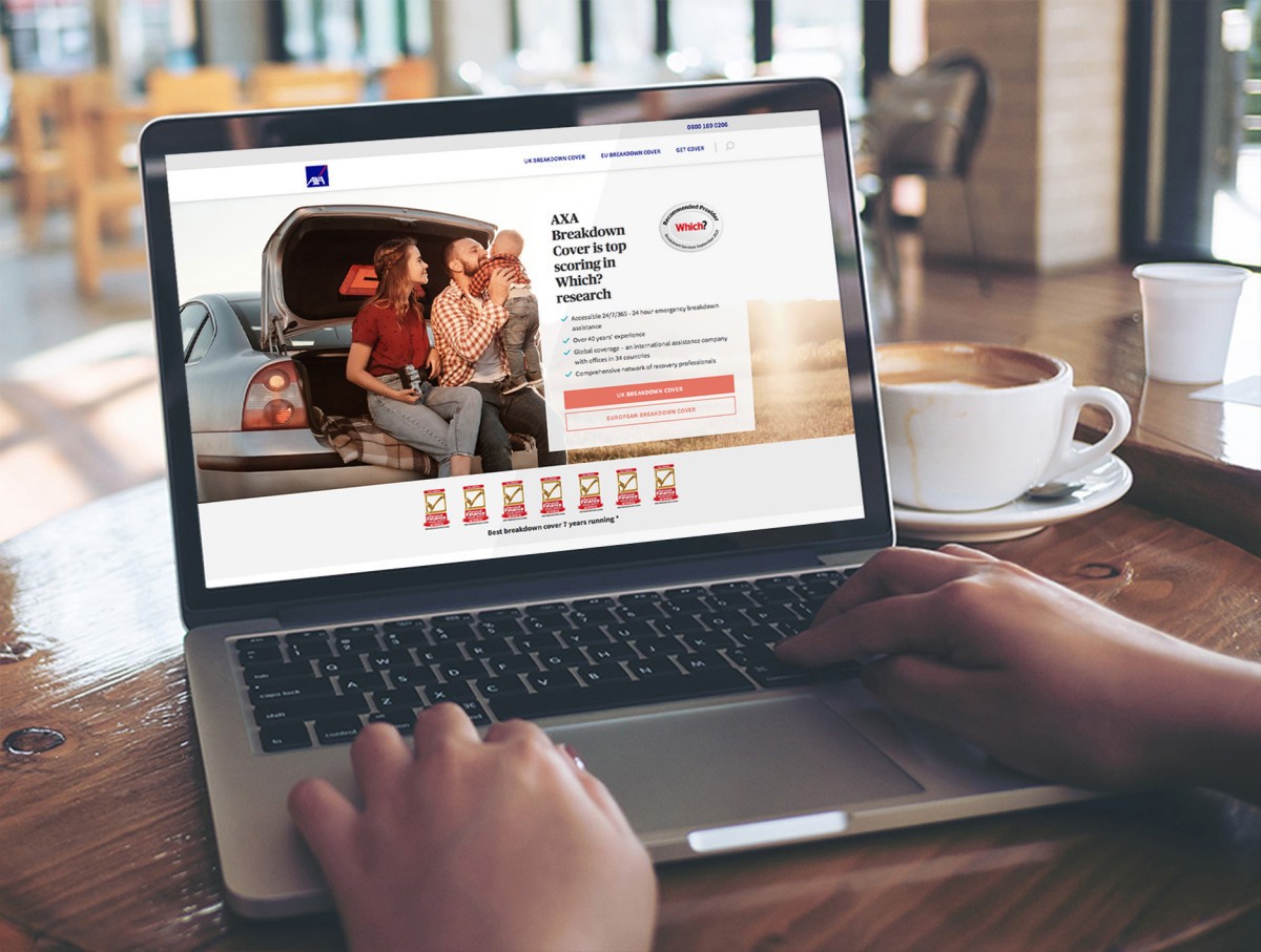

Delivering a new, more user centered website, refreshing the brand, extensive IA and all UX, UI and commissioning and overseeing the technical build
The Pensions Advisory Service website had evolved over the years and large parts of it were broken, information was hard to find and it was full of dead ends and circular searches. On top of this, much of the writing was complex legalese and as such impenetrable for users. It also looked, well, dreadful. However, TPAS performs a vital service – and increasingly so with changes to the state pension, pension deficit, longevity and auto-enrolment. The problem was that the brand looked confused, old fashioned and didn’t reflect the expertise they have and the desire to help that is there.
People generally feel out of control of their pensions and too often feel let down by performance. This is compounded by a climate of skepticism when it comes to financial products following negative stories and the fear of the ‘pensions black hole’. Pensions are complicated and feelings are confused. We needed to make them simple.

In our strategic planning and workshops we identified that there were three core parts to the TPAS offering:
1. Detailed and definitive pension information
2. Sorting out problems with pensions and pension providers
3. General help and advice


Delivery
The original website this replaced was huge and the amount of information needed to be created and migrated was enormous. There were thousands of pages of detailed pensions information which needed to be re-written to sound less technical and more user-friendly and a new, more user centric online experience delivered
We created structure, planning and design of the website and commissioned Daisy Chain Tech and SEO partners to deliver the finished front and backend build. The result is a more creative communication led website with a clear social media content strategy we put in place also
The work is testament to having a strategic, financial services creative expert leading the concept, copy and UX and delivering the UI, staying hands on to oversee the technical delivery and ensuring it remains true to the strategic and creative vision


“In terms of users visiting the website, this has increased since the redevelopment. From the analytics, most people are visiting the site, seeing the number or webchat facility and coming direct to the helpline- this is ideal and aligned to our corporate objectives. We’ve had a warm response around the tone of the site and the website has been referenced by a number of journalists as a great source for pension information. We’ve received a positive response from staff, stakeholders and users regarding the new look and tone.”
Michelle Cracknell, CEO, TPAS